Access to recent economic data is a must-have for interpreting political and business news. Imagine a business that claims to have boosted sales by $200,000 over the course of the previous year. Without knowing the CPI index for that time period, how are you going to know how much of that growth was eaten up by inflation? Consider a report portraying a stubbornly high unemployment rate in a U.S. state. Is unemployment high because people are losing their jobs, or is the labor force expanding faster than job growth?
By using economic indicators to better interpret data, we can achieve a more contextualized understanding of what’s happening in the U.S. Since many of these indicators are updated monthly or quarterly, it can be frustrating to always be downloading new data sets and deleting old ones, especially when you need to root around obscure government websites to find them.
Fortunately, the research team at the St. Louis Federal Reserve aggregates and reports U.S. economic data in a simple, easy-to-access database known as Federal Reserve Economic Data (FRED). The website of the St. Louis FRED provides many ways to visualize economic indicators. By searching for your data of interest, you can pull up a time-series visualization that is filterable by time and place.
You can even link to these visualizations as iframes to use in your own dashboards or website. To do this, select “share link” and then the option to “embed in website.”
This iframe presents average CPI data for Food and Beverage in U.S. Cities (seasonally adjusted).
Accessing Economic Data through FRED
Of course, often you will want just the data, not a whole visualization. FRED makes it easy to access the data as a text file. Simply follow these steps:
- Find the dashboard in FRED with the data you want to extract
- Copy the URL of this dashboard
- Replace the word “series” in the URL with the word “data” and add the extension “.txt” following the URL
- Use the R utils function
read.tableto load this data straight into your R session. No bulky download required!
Hint: It will help to use the “skip” argument of the read.table function to skip over several lines when loading the table, so you can work with the appropriate column headers. In this case, skipping 400 lines gives us data starting in May 1999.
cpi_urban_food <-
  # load data from the St. Louis Fed website (skipping many months from last century)
  read.table("https://fred.stlouisfed.org/data/CPIFABSL.txt",
             skip = 400)
Working with FRED in R
We can then plot this data or join it to other data to perform statistical operations. For now, let’s recreate the iframe from above using the ggplot2 library. We also use the dplyr and lubridate libraries to easily transform the month-year column into ‘date’ format.
# load packages from the tidyverse collection
# you can also call library(tidyverse) instead of loading individual packages
library(ggplot2)
library(lubridate)
library(dplyr)

cpi_urban_food_formatted <- cpi_urban_food %>%
  # change column V1 into date format
  mutate(month_year = as_date(V1)) %>%
  # change cpi to numeric data
  mutate(cpi = as.numeric(V2))

# note that the double parentheses lets us save the object and display it
(plt_cpi <- ggplot(data = cpi_urban_food_formatted,
       aes(x = month_year, y = cpi)) +
  geom_line() +
  labs(x = 'Month Year',
       y = 'CPI',
       title = 'Food and Beverages CPI U.S. City Average',
       caption = 'Source: U.S. Bureau of Labor Statistics'))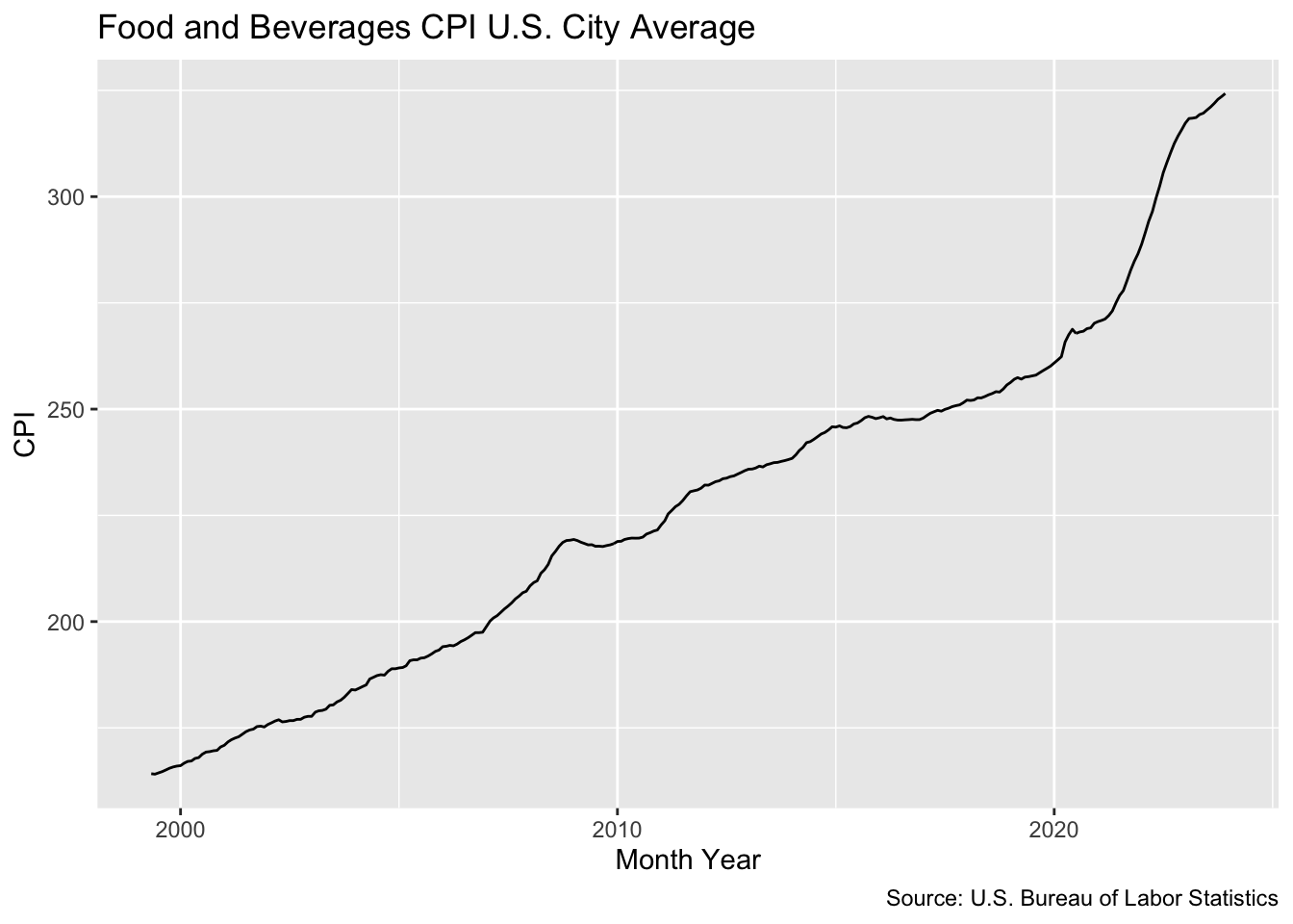
Now, there’s not much point in creating custom visualizations that provide the same information as the out-of-the-box FRED dashboard. To better contextualize the data, we can shade in time ranges that reflect economic downturns in the U.S.
cpi_urban_food_formatted <- cpi_urban_food_formatted %>%
  mutate(Downturn = case_when(
    month_year >= "2001-03-01" & month_year <= "2001-11-01" ~ '2001 Recession',
    month_year >= "2007-12-01" & month_year <= "2009-06-01" ~ '2008 Recession',
    month_year >= "2020-01-10" & month_year <= '2023-05-11' ~ 'Covid'
  ))

(plt_cpi_ribbon <- plt_cpi +
  geom_ribbon(
    # use a filtered data set to avoid placing NA values in legend
    data = cpi_urban_food_formatted %>% filter(!is.na(Downturn)),
    aes(ymin = min(cpi_urban_food_formatted$cpi), ymax = cpi, fill = Downturn),
    alpha = .2))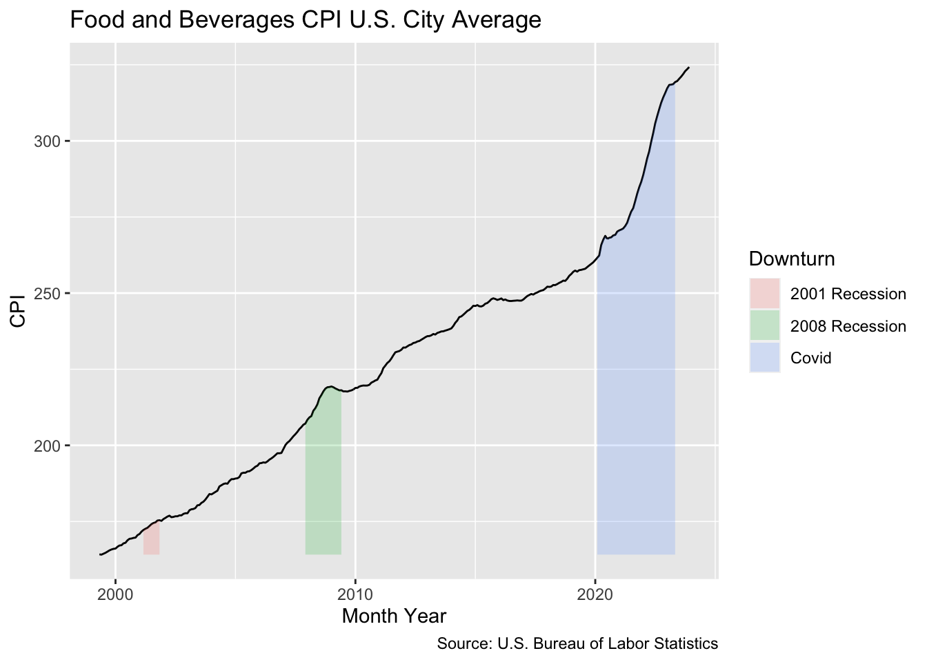
Tip: Once you’ve created a visualization that you are happy with, you can easily customize your graphs to add your own style. Using the ggthemes package, we can format this graph to follow the style guidelines of the Wall Street Journal.
library(ggthemes)

plt_cpi_ribbon +
  theme_wsj(base_size = 7,
            color = 'gray')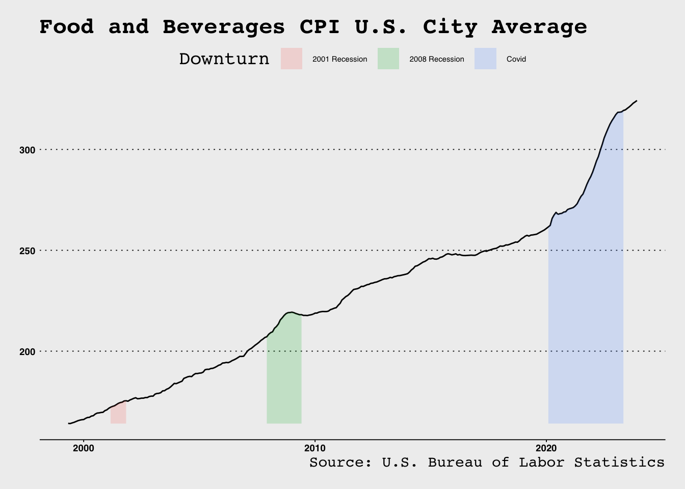
In Review
The research team at the St. Louis Federal Reserve makes it easy to incorporate key economic indicators into your own analyses. Data are available from a wide number of different government data sources and for a wide variety of U.S. geographies. You can either view data in the dashboards made available on the FRED website, or you can import the data into your RStudio working session.