RStudio provides many ways to assess the effects of government and non-profit programs. The program’s powerful libraries make it easy to render complex datasets into simple insights. The following blog post illustrates how to use R to analyze the effects of the government program Cal-Fresh (known outside California as the Supplemental Nutrition Assistance Program or “SNAP”). By following along, you’ll be able to reproduce this methodology to visualize the effects of similar public-sector programs.
Understanding Cal-Fresh
In 2019, economists at the USDA studied the impact of the Supplemental Nutrition Assistance Program (SNAP), formerly known as Food Stamps, on the U.S. economy and its job market. Known in California as Cal-Fresh, this program provides food-purchasing assistance to low-income and no-income families. Funded through the Farm Bill, the aim of the program is not only to help those who are experiencing hunger, but also to stabilize the supply chain of food in the nation, especially during economic downturns.
When an economic downturn occurs, businesses in the food supply chain may be inclined to reduce the scale of their operations and produce less food. If this slowdown of the supply chain happens on a large enough scale, prices may rise as supplies and jobs lower, meaning that lower-income populations won’t be able to afford food. By providing consumers with supplemental dollars to spend at the grocery store, SNAP/Cal-Fresh provides a financial incentive for the supply chain to maintain its scale even when unemployment is on the rise.
In their 2019 study, the economists at the USDA found that SNAP spending not only helped stabilize the food supply chain, but that it further provided an efficient way to stimulate growth in the economy. They found that every billion dollars spent on SNAP leads to a 1.54 billion dollar increase in Gross Domestic Product (GDP) and creates 13,560 jobs. The reason that spending on SNAP boosts GDP and jobs is that the money provided to consumers creates incentives for farmers, logistics companies, and grocery stores to expand their infrastructure to meet the consumer demand. This expansion requires the industry to hire more people, from farmhands to truck drivers to shelf stockers, boosting the economy.
How does Cal-Fresh affect the Economy?
Load Libraries
library(tidyverse)
library(lubridate)
library(readxl)
library(leaflet)
library(tidycensus)
Load Data
Data for this analysis come from the California Department of Social Services, which every month collects data from the county-level agencies in charge of distributing CalFresh dollars. The resulting report, known as the ‘DFA 256 - Food Stamp Program Participation and Benefit Issuance Report’, provides monthly data on the number of CalFresh participants and the aggregate amount of money for food purchasing that they have received. For this analysis, we will be looking at Fiscal Year 2022, containing data from July 2021 to June 2022.
snap_raw <- read_excel('data/SNAP_issuances_CA_FY22.xlsx')Format Data
Well-formatted Excel sheets don’t always create the tidiest data for analysis in R. Selecting only certain columns and renaming row 30 will make the data better shaped for analysis.
snap <- snap_raw %>%
  select(Date, `County Name`, `Report Month`, `30`) %>%
  rename(`Total Issuances` = `30`) %>%
  # remove aggregate statistics from the county-level statistics
  filter(`County Name` != 'Statewide') %>%
  # format report month as a date instead of a datetime
  mutate(`Report Month` = as_date(`Report Month`))
Analyze Trends over the Course of the Year
Since we are going to build a map illustrating the effects of SNAP issuance on the California economy, we first want to understand how the program is growing or shrinking over time.
Aggregating data by month-year will help us understand how the program is changing in California.
monthly_aggregate <- snap %>%
  # calculate issuance totals by month
  group_by(`Report Month`) %>%
  summarize(`Statewide Total Issuances` = sum(`Total Issuances`, na.rm = T)) %>%
  ungroup() %>%
  # calculate percent change month to month
  mutate(`Monthly Change` = (100 *
    (`Statewide Total Issuances` - lag(`Statewide Total Issuances`)) /
           lag(`Statewide Total Issuances`))) %>%
  # calculate percent change from beginning of fiscal year
  mutate(`Year Change` = 100 *
           (`Statewide Total Issuances` - `Statewide Total Issuances`[1]) /
           `Statewide Total Issuances`[1])
monthly_aggregate %>%
ggplot(aes(x = `Report Month`,
y = `Statewide Total Issuances`)) +
geom_col(fill = '#ea7600') +
scale_y_continuous(labels = scales::dollar)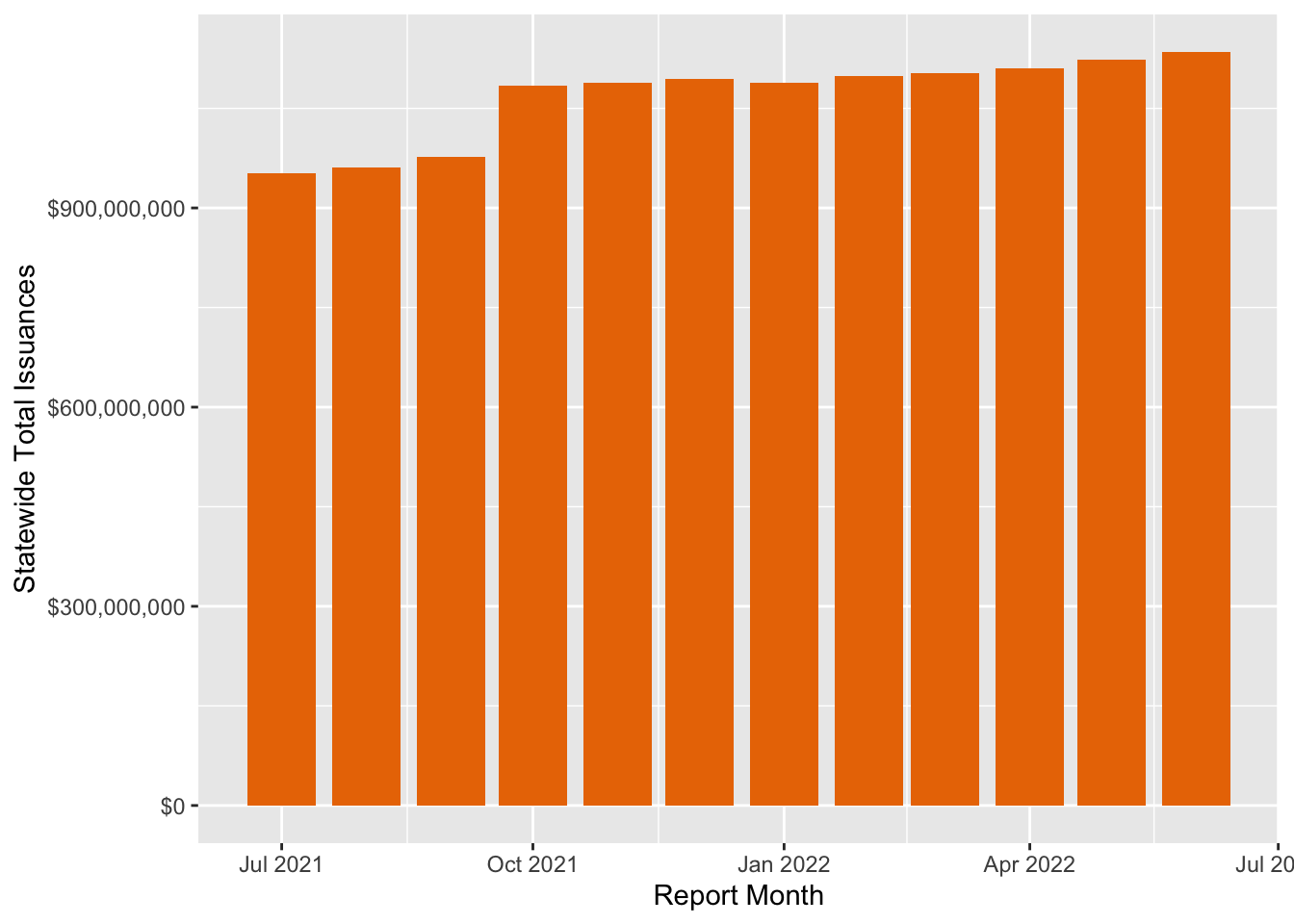
Between July of 2021 and June of 2022, Cal-Fresh issuance appears to have increased 19.2%. While most of this increase is the result of an 11% increase from September 2021 to October 2021, statewide issuance continued to rise 4.7% from October 2021 to June 2022.
At first glance, the program appears to have grown throughout fiscal year 2022.
However, it’s important to note that the considerable rise in October 2021 is due to the fact that October is the time of year when the federal government increases SNAP (and thus Cal-Fresh) issuance to account for the yearly rise in the cost of living. Furthermore, back in August of 2021, the Biden administration re-evaluated the thrifty food cost plan used to determine SNAP issuance, which led to a substantially higher increase that year.
Given that some of the rise in Cal-Fresh issuance is the result of the cost-of-living adjustment and not an expansion of the program, we will want to distinguish growth in nominal dollars vs. growth in constant dollars. While nominal dollars make it appear the program is growing, constant dollars account for how much of that growth is eaten up by inflation. Let’s use the CPI index from the end of the fiscal year (June 2022) to make the nominal dollars from SNAP issuance constant. We can do this by loading historical CPI data from FRED (the St. Louis Federal Reserve) and then scaling this data so that June 2022 appears with the base 100. Then, we can divide the SNAP issuance by the scaled CPI index for the respective time periods.
monthly_cpi <-
  # load data from the St. Louis Fed website (skipping many months from last century)
  # you can use this method to pull from other FRED tables
  read.table("https://fred.stlouisfed.org/data/CPIAUCSL.txt",
             skip = 600) %>%
  rename(`Report Month` = V1,
         CPI = V2) %>%
  mutate(`Report Month` = as_date(`Report Month`)) %>%
  filter(`Report Month` > '2021-06-01')

june_2022 <- monthly_cpi %>%
  filter(`Report Month` == '2022-06-01') %>%
  select(CPI)

monthly_cpi <- monthly_cpi %>%
  mutate(CPI_scaled = 100 * CPI / june_2022[[1]])
Performing this transformation from nominal dollars to constant dollars, we observe that the growth in SNAP issuance is mostly attributable to the cost-of-living and re-evaluation adjustment in October, with the constant dollars of SNAP issuance actually lowering throughout the remainder of the fiscal year.
monthly_aggregate_adjusted <- monthly_aggregate %>%
  left_join(monthly_cpi, by = 'Report Month') %>%
  mutate(`Statewide Total Issuances (Constant)` =
           100 * `Statewide Total Issuances` / CPI_scaled)

monthly_aggregate_adjusted %>%
  ggplot(aes(x = `Report Month`,
             y = `Statewide Total Issuances (Constant)`)) +
  geom_col(fill = '#ea7600') +
  scale_y_continuous(labels = scales::dollar)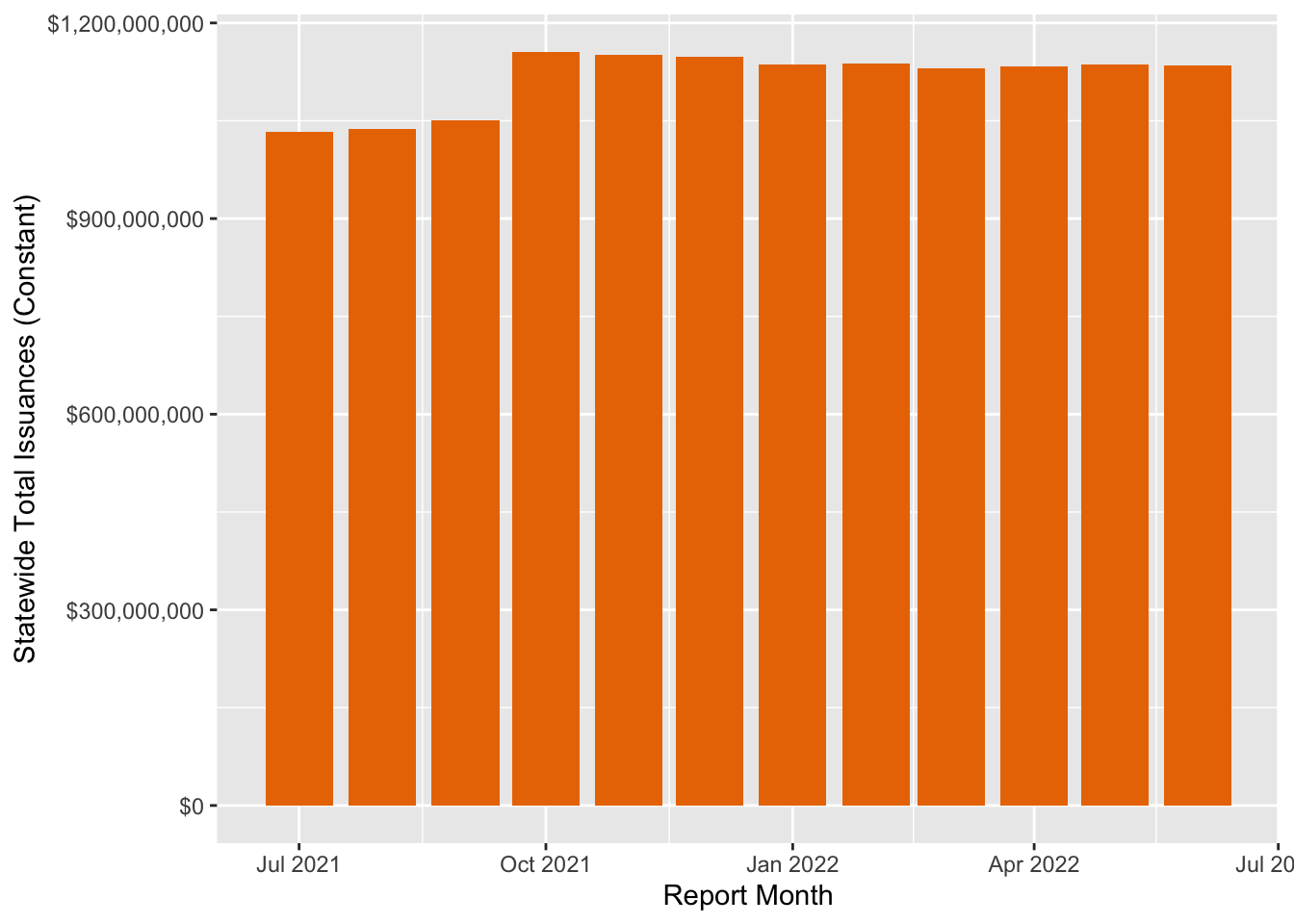
Now let’s perform that same inflation adjustment on the monthly county-level data.
county_month_adj <- snap %>%
  left_join(monthly_cpi, by = 'Report Month') %>%
  mutate(`County Issuances (Constant)` =
           100 * `Total Issuances` / CPI_scaled)
Analyze Data by County
Having accounted for inflation, we can now assess the county-level effects of Cal-Fresh/SNAP in California by multiplying 1 billion in SNAP issuance by 1.54 billion in GDP and 13,560 jobs.
county_year_sum <- county_month_adj %>%
  group_by(`County Name`) %>%
  summarise(`FY Issuance Total` = sum(`County Issuances (Constant)`)) %>%
  mutate(`GDP Growth` = `FY Issuance Total` * 1.54,
         `Job Growth` = `FY Issuance Total` * 1.356e-05)

ca_year_sum <- county_month_adj %>%
  summarise(`FY Issuance Total` = sum(`County Issuances (Constant)`)) %>%
  mutate(`GDP Growth` = `FY Issuance Total` * 1.54,
         `Job Growth` = `FY Issuance Total` * 1.356e-05)

FY_total <- ca_year_sum$`FY Issuance Total` %>% scales::dollar()
gdp_total <- ca_year_sum$`GDP Growth` %>% scales::dollar()
job_total <- ca_year_sum$`Job Growth` %>% scales::comma()
Across the state of California, $13,385,869,175 spent on SNAP/Cal-Fresh in fiscal year 2022 resulted in $20,614,238,530 in GDP growth and added 181,512 jobs to the state’s economy.
On the county level, the more populous urban regions of the state accounted for the larger proportions of SNAP spending. By helping to ensure the purchasing power of urban consumers, SNAP/Cal-Fresh spending spreads its GDP and job growth across the state’s agricultural economy.
Map the Effects of SNAP Spending
We can pull county-level population and geometry data from the American Community Survey using the tidycensus package to map the effects of Cal-Fresh spending across different counties in California. By dividing constant FY 2022 issuance dollars by the county population, we can calculate Cal-Fresh spending per capita, which helps us understand differences in need and spending across counties.
First, let’s pull the data. We use the tidycensus function get_acs() to make a call to the Census API, and then we join this data with the Cal-Fresh issuance data.
options(tigris_use_cache = TRUE)

# extract census data on county geometries and populations
ca_counties <- get_acs(
  geography = "county",
  variables = c(pop_ = 'B01003_001'), # population variable for acs5
  output = 'wide',
  state = 'CA',
  geometry = TRUE,
  year = 2021,
  cb = FALSE,
  survey = 'acs5') %>%
  mutate(`County Name` = gsub(" County, California*.", "", NAME))

ca_counties_snap <- ca_counties %>%
  left_join(county_year_sum) %>%
  mutate(SNAP_Per_Capita = `FY Issuance Total` / pop_E) %>%
  mutate(across(where(is.numeric), ~round(.x, 2)))
Now, with the data, we use the leaflet package to visualize differences between counties. While urban regions like LA and Orange counties account for large proportions of Cal-Fresh spending, it’s interesting to observe that per capita spending tends to be higher in rural regions, suggesting either a greater need in these regions or a county-level government willing to distribute more funds. The higher levels of per capita spending in these regions may also relate to their lower cost of living with respect to urban regions. Since the cost of living tends to be higher in urban regions, relatively fewer people in those regions meet the California Cal-Fresh requirement of living below 200% of the federal poverty line. Further research is necessary to explain these county-level differences in per capita spending as well as to better understand where GDP and job growth may be distributed across the state.
snap_palette <- colorNumeric(palette = "viridis",
                          domain = ca_counties_snap$SNAP_Per_Capita,
                          na.color = "transparent")

snap_label <- paste0(
  "County: ", ca_counties_snap$NAME,
  "<br/>",
  "FY 2022 Cal-Fresh Issuance per Capita: ",
  "$", ca_counties_snap$SNAP_Per_Capita,
  "<br/>",
  "FY 2022 Cal-Fresh Issuance: ",
  "$", ca_counties_snap$`FY Issuance Total`,
  "<br/>",
  "GDP Growth: ", ca_counties_snap$`GDP Growth`,
  "<br/>",
  "Job Growth: ", ca_counties_snap$`Job Growth`) %>%
  lapply(htmltools::HTML)

ca_counties_snap %>%
  leaflet() %>%
  addTiles() %>%
  addPolygons(
    color = ~snap_palette(SNAP_Per_Capita),
    opacity = 1,
    weight = 1,
    fillOpacity = .4,
    label = snap_label,
    group = 'SNAP') %>%
  addLegend(
    position = 'topleft',
    pal = snap_palette,
    labFormat = labelFormat(prefix = "$"),
    title = 'Cal-Fresh Issuance per Capita',
    values = ~SNAP_Per_Capita)
The code above produces an interactive Leaflet choropleth of California counties shaded by Cal-Fresh issuance per capita, with hover labels showing each county’s issuance, GDP growth, and job growth.